
Content Design
News, public communications, digital marketing, product launches
KCLU Public Radio
Project: E-newsletter design
My role: UX Designer, Content Producer
Team: Me, KCLU senior management
Tools: Mailchimp
Goal: To create and deploy a design template for KCLU’s weekly e-newsletter. The project required skills in information architecture, user interface design, and copywriting.

KVNF Public Radio
Project: E-newsletter design
My role: UX Designer, Content Producer
Team: Me, KVNF senior management, news reporters.
Tools: Mailchimp
Goal: To create and deploy a design template for KVNF’s weekly e-newsletter. The project required skills in information architecture, user interface design, and copywriting.

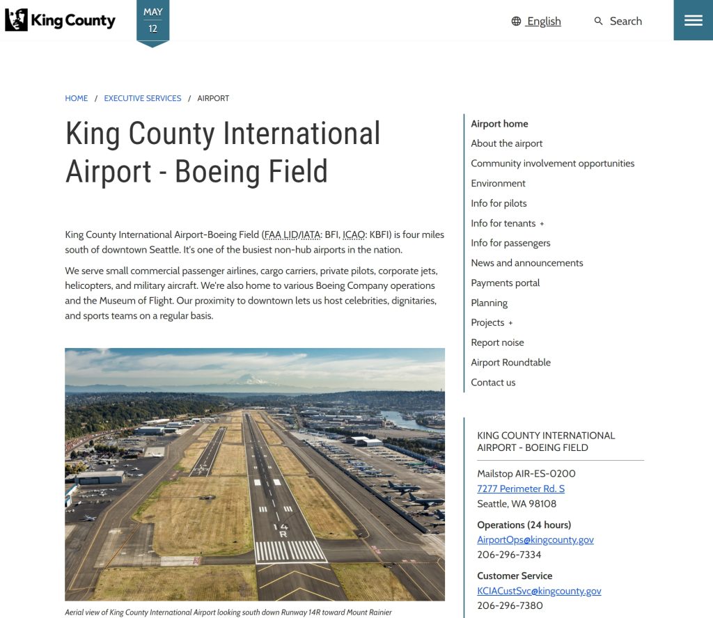
King County, Washington
Project: Web Design Refresh
My role: UX Designer, Content Producer
Team: Me, King County Information Services, Sitecore 10 migration specialists, UX researchers, accessibility specialists, and IT services developers.
Tools: Sitecore 10, Microsoft Office, Azure DevOps, LucidCharts
Goal: To completely redesign a municipal website serving over 2 million people. The project included a new information architecture, user interface design, and UX copywriting.
State of Colorado
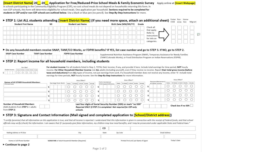
Project: Application Form Redesign
My role: Information Designer
Team: Me, the SE2 Agency, state agency representatives
Tools: Microsoft Word
Goal: To redesign an application form for free school lunches. The previous form was difficult to navigate and understand. The completed form reduced information overload and introduced a bit more white space.
Challenges: The newly designed form couldn’t exceed two pages, including legally required “fine print” on page two. The form also had to be redesigned using Microsoft Word, with its inherent design limitations.
Hayden Data Systems
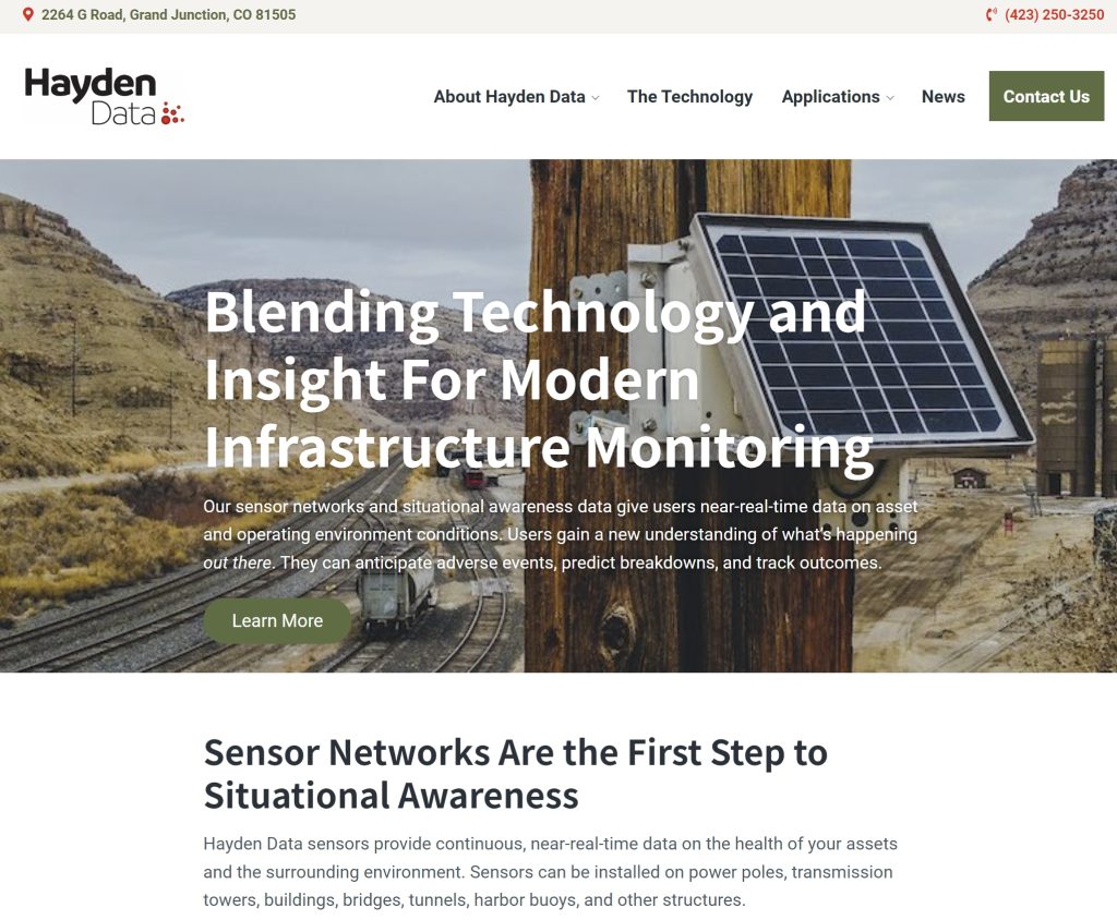
Project: Marketing Content for SaaS launch
My role: Information Designer, Copywriter
Team: Me, MySalesButler Marketing, Hayden Data Systems management.
Tools: Microsoft Office, Google Suite, WordPress
Goal: To introduce a SaaS product to potential clients. The website copy had to be relatively technical, inviting, and easy to read. The company needed to clearly state the why of its service, which is community safety and asset protection. It also needed to explain how its technology works in a language easily understood by laypeople.
KSUT 2024 Voter Guide
Project: Page Design and Build
My role: Web UX Designer, Information Architect
Team: Me, KSUT management
Tools: NPR Grove CMS, Google Suite, Trello, Slack
Goals: To create a user-friendly, accessible online resource for information on how to vote in the 2024 General Election.
My work: I created the page structure, navigation, and presentation features. I also built anchor-linked navigation buttons, tabbed information, and a custom sidebar.
Results: The page is getting 4,000-5,000 unique visits since its launch.
